The Yield Curve – Part 2
Blog post
10/30/24In the last blog, we went through what the yield curve is and what kind of shapes it can make. You can read Part 1 here. In Part 2 of this series, we talk a little more in-depth about the implications of the yield curve for the economy and what it might mean for your portfolio.
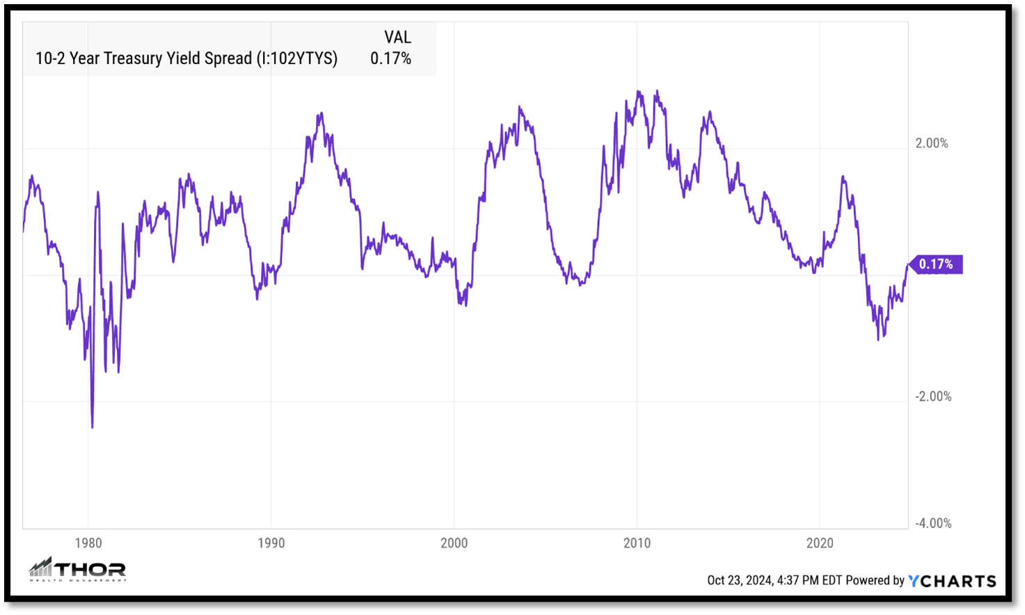
When we showed the different shapes in Part 1, we were showing all the different yields on all the different maturities at a single point in time. Another way of analyzing this data is by taking the difference between two different maturities and plotting them on a graph. Once you do that, you can see the overall changes of the yield curve over a longer period rather than just a point in time. Below is a visualization of the 10y-2y treasury yield curve.

Yield curve level
As you can see, the difference (also known known as spread) between the two maturities is currently a positive 0.17%. When the graph line is in the upper range of the chart, the spread is wide, and the yield curve is generally steep. When the line is at the lower range of the chart, the yield curve is considered flat. When the line is below zero, the yield curve is inverted.
Yield curve direction
In addition to the level of the yield curve, the direction is also important. As the line graph goes up, the yield curve steepens and as the line falls, the yield curve flattens and eventually becomes inverted.
Yield curve and expectations on the economy
The yield curve reflects the bond market’s expectations for economic growth and inflation. It is telling a story about future growth and inflation expectations. As the yield curve steepens (moves up), the longer-term maturity yields are rising faster than the shorter-term maturity yields. This signals that they expect higher growth in the future.
As the economy starts to grow, inflation also starts to pick up. Eventually, the yield curve hits an inflection point and peaks. At this point, the market expectations are saying that the economy is starting to get ahead of itself, and inflation expectations are starting to get too high.
In response to higher inflation, the Federal Reserve is expected to raise rates to “cool” inflation. The shorter maturity yields (2yr treasury bond) start to increase as this expectation becomes reality. With high short-term rates, borrowing becomes more expensive, consumer spending falls, which drives down inflation expectations. Lower inflation expectations start to get priced into the market which in turn lowers longer-term bond yields. As both of those play out, the yield curve starts to decrease with short-term yields rising while the long-term yields fall.
Eventually, as the Federal Reserve continues to raise rates, they hit an inflection point when they are too high and the yield curve inverts. This signal from the bond market is that the Federal Reserve needs to start lowering rates as expectations for growth and inflation are now too low. In response to the economy slowing, the Federal Reserve starts to lower rates to encourage consumers to begin borrowing again.
As the cycle plays out, businesses start to invest with increased consumer demand. Eventually, the economy bottoms out and the business cycle reverses. Growth expectations start to improve, inflation expectations start to pick up, and the yield curve is increasing and steepening.
Implications on your portfolio
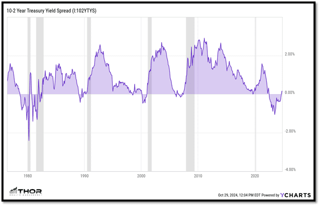
To highlight the yield curve cycle, the chart below shows the 10y-2y treasury yield curve again, but we added an overlay of official US recessions (grey areas). If it is not clear from the image, the yield curve tends to be a leading indicator for the economy. It typically has an inversion before the economy goes into recession (grey bars).

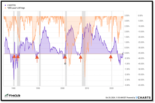
The last chart below adds one more piece of information that really tells the rest of the story. In addition to the recession bars, I included red arrows when the yield curve went from inverted (below 0) to positive. To show the reason I included the arrows, I did an overlay of the “percent off high” for the S&P 500 in orange. If you go through the chart, it is obvious that the yield curve inversion is a precursor for a rocky economy but historically, the worst stock market returns happen after the inversion period when the yield curve starts to steepen (red arrows).

Conclusion
Hopefully, this was a constructive explanation of the yield curve cycle and how it potentially impacts your portfolio. This is a timely lesson as the yield curve is currently going through one of the inflection points I described above. It was inverted for the longest period and has just started to steepen. It is especially important to remember that there is no perfect indicator and timing the market is extremely hard to do over time. The yield curve is just one indicator that should be considered among many prior to making any investment decisions.
If you have questions and would like to talk with us further, please call us at 513-271-6777. For more THOR reading, click here to go to the Blogs and Market Updates section on our website. Follow us on social media: