The yield curve is arguably the most popular economic indicator. It can tell you a lot about the future with respect to the markets and the economy. This will be a multi-part series on the yield curve. In Part 1 we will discuss what the yield curve is and go into detail on the three different types of yield curves. In Part 2, we will talk about the yield curve’s general implications as they pertain to the market and economy along with yield curve changes and what they mean. Lastly, we will bring it all together and discuss where we are today and what we might expect just looking at this one indicator.
What is the yield curve?
When someone mentions the yield curve, they are usually talking about a graph plotted with treasury rates shown across various maturities at a specific time. Treasuries, also called T-Bonds, are fixed-rate debt securities issued by the US government which can be bought by other entities like citizens, other nations, institutions, and bond investors. When looking at the yield curve, the left most part of the x-axis is the shortest maturity whereas the right most part of the x-axis is the longest maturity. Typically, the shortest maturity for treasuries is the 3-month maturity and the longest is the 30-year treasury. The other maturities you will see most often between those are the 2-year, 5-year, and 10-year treasury maturities.
Types of yield curves
Type #1: Normal Yield Curve
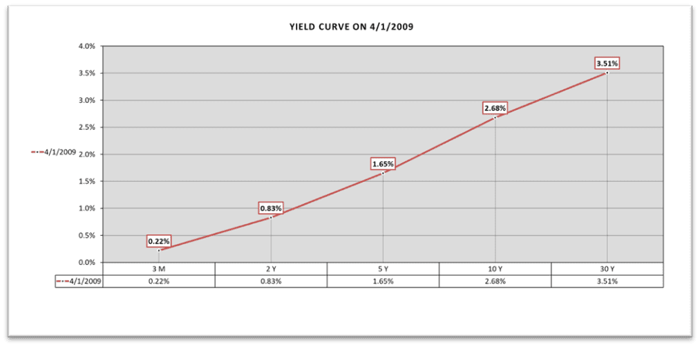
When talking about the type of yield curve, we are talking about the shape it is making. The first shape is called a “normal yield curve” and is shaped upward like a ski lift. On one end, the shortest maturity has the lowest yield, and on the other end, the longest maturity has the highest yield. It is called normal because most of the time the yield curve is in this shape, and it makes sense from a logical standpoint. When lending money for 30 years, you should expect a higher interest rate because there is more uncertainty i.e. more risks in comparison to lending money over 3 months. Below is a graph of the actual yield curve on 11/1/2009.

Type #2: Flat Yield Curve
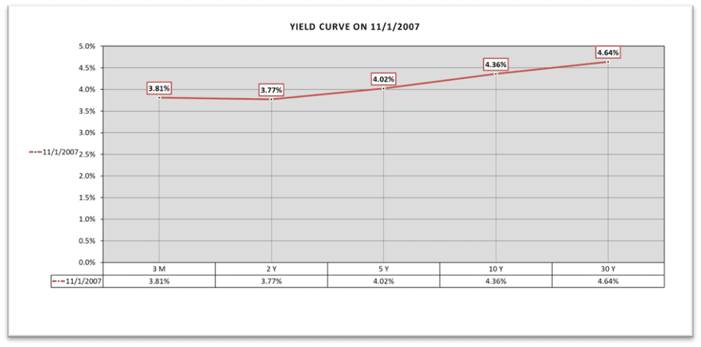
When the yield curve is “flat,” yields are (more or less) the same across all maturities. The 3-month yield (shortest maturity) will receive roughly the same rate for lending money out as the 30-year maturity. In a flat yield curve, you are not compensated additional yield for lending out over a longer period. Below is a graph of the yield curve on 11/1/2007 and this would be considered a (more or less) flat yield curve.

Type #3: Inverted Yield Curve
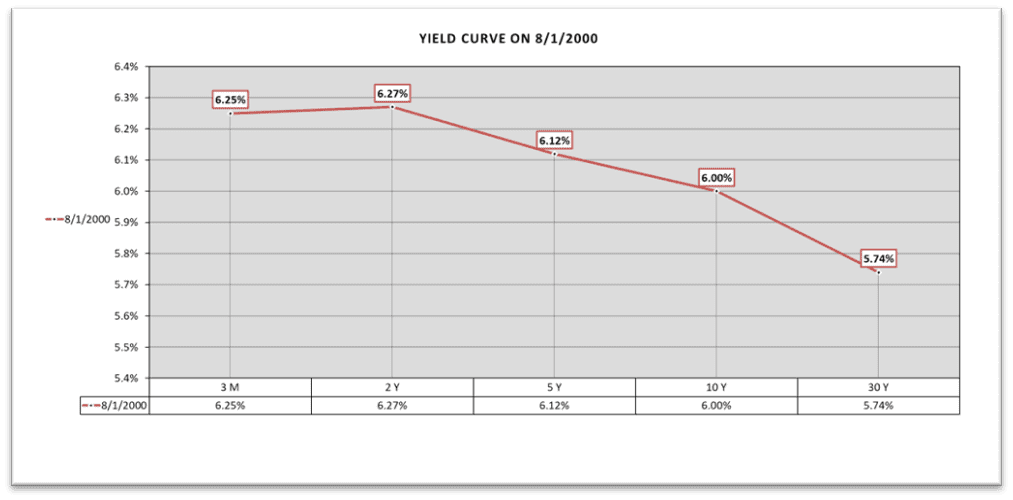
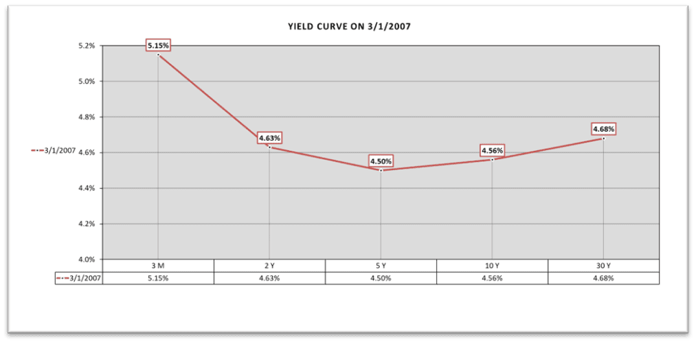
An “inverted” yield curve is when the shape of the yield curve is like looking down while standing on top of water slide. The shortest maturities have a higher yield (higher interest rate), and they progressively go down while the maturity gets longer. From a logical standpoint, this does not make a lot of sense (more of this in our next blog). An investor should expect to be rewarded with a higher interest rate the longer the maturity they are lending out. The longer period increases the risk by adding more uncertainty. Below are two charts of actual inverted yield curves from two different time periods. Do you notice any similarities in these dates and curves? We will talk more about the implications in Part 2!


Conclusion
Now that you have a basic understanding of what the yield curve is and the different shapes it can form over time, we will have a deeper discussion in my next blog on the implications of different yield curves, with examples from history to help explain what the yield curve might be telling us about the economy, market and your portfolio. We will end the blog by analyzing the current yield curve and applying the same logic to scenarios we might see in the future.
If you have questions and would like to talk with us further, please call us at 513-271-6777. For more THOR reading, click here to go to the Blogs and Market Updates section on our website. Follow us on social media:


